Mixed Media Project
Artists Create Original Ideas- Prior to starting this project, I had been learning about Roman history and looking into Roman art and stuff. For the project, Mrs. Rossi had five topics that you could choose from, fairy tales being one of them. While it is not technically a fairy tale, ancient mythology is fictional and fantastical. Even though I had been learning about Roman mythology, I think that the Greek stories are more known and iconic. The two are very similar, so I chose to go with Greek. I needed a way to bring the pictures together, so I decided that the bottom of the paper would be dedicated to Hades, the middle would be for the mortals and normal environment, and the top would be for Heaven. After a little bit of tweaking, I came up with what ended up being the final project. I don't think that anyone else did Greek mythology and I think that it is was a good idea. However, it wasn't wholly original as I used already existing pictures and a prompt from Mrs. Rossi.. I give myself a 3
Artists Have a Global Awareness of Artmaking- Naturally, I took a lot of inspiration from Greek Artists and historians. To find good reference points for the project, I googled Greek mythology and found pictures that I thought would work well together. Because I knew about the subject I was able to bring the pictures together in a way that I felt worked well. I give myself a 4.
Artists Develop Art Making Skills- I have made colleges before, but it was a long time ago and was probably during middle school or elementary school. I honestly have never really enjoyed it, but I found it fun this time. Maybe this was just because it was a nice break from the previous projects. It took me a longtime to get used to making backgrounds for these collages. This one went a little bit better, as I was able to make the background look more full and organized then before. I also think that I found a better way to paste down the clippings. Still, it still was kind of sloppily done and had some issues. I would give myself a 3.
Henry's Arttastic Fun Blog Fo' Kids
Thursday, June 5, 2014
Tuesday, May 6, 2014
Sticky Situation
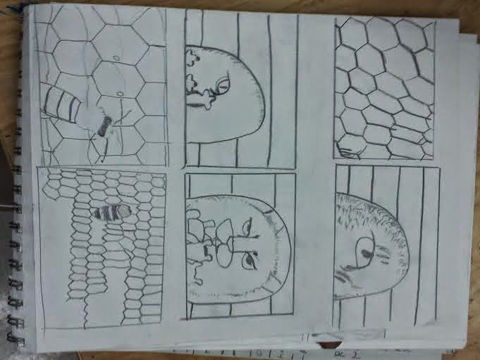
Artists create original art- When I started coming up with ideas for the project, I was only thinking of things that were literally sticky. However, Mrs. Rossi encouraged me towards coming up with some less literal ideas. A lot of them involved humans interacting with each other in uncomfortable situations. The problem with those ideas is that I realized I can't draw humans at all. So, sadly, a lot of those ideas were disregarded. One of them was a person staring at a lion or tiger in the jungle. I thought that the idea was pretty good, and I saw that it could be applied to many other situations. I thought of Tom and Jerry cartoons and how Jerry always escaped into his mouse hole. I decided to transfer my original idea into that concept, and that's how I came up with the idea. I picked the references after this. I would give myself a 4.
Artists develop new skills- While I liked the idea, I feel like my execution of the project was rather poor. I realized too late into the project that i wasn't really capable of making the mice look realistic at all, and I had no experience painting wood. While I did make some progress learning how to give the wood texture, I'd say that I was never able to fully grasp the subject and move beyond my limitations. I would give myself a 2.
Artists take risks- Even if the project didn't come out very well, I think that I can at least say that I took a risk painting it. There were a lot of things to factor into the painting, and a lot of things could have went wrong. While I think that I should have picked something that was more in my weight class, it was somewhat admirable that I chose to take the risk. I give myself a 3.
Tuesday, March 25, 2014
Candy (Chalk Pastels)
This is the candy drawing, made with chalk pastels. This is easily the most successful of the three. The chalk pastels are very easy to blend together. In fact, the candy is what I based the yolk of my egg piece off of. The candy looks spherical and very smooth, and the wrapper looks realistic. The only issue is that the candy doesn't look like it is in the wrapper, and more underneath it.
Soda Can (Oil Pastels)
This is my soda can drawing. It was made with oil pastels, and I have mixed reactions about how it turned out. On one hand, I don't think that by blending was completely effective and it doesn't look like the can I modeled it after. On the other hand, I feel like all of the colors put together look cool even if they aren't realistic. The oil pastels were a little easier to blend with than colored pencils.
Lollipop (Colored Pencil)
This is my lollipop drawing, created with colored pencils. Personally, this was the hardest candy related drawings that we did. Unlike the pastels, colored pencil doesn't as easily blend together. There was more detail in the lollipop, and it was hard to portray the individual crinkles and folds in the wrapper. I attempted to put in a shadow at the end, but it didn't work out quite as well as I wanted and wasn't completely successful.
Friday, March 21, 2014
Up Close Eggs
Artists Create
Original Art
The theme for the project was up-close and personal. At first I didn’t know what to do. I thought of multiple ideas, but I wasn’t
sold on any of them for a long time.
However, I stuck with the egg idea after one of the warm up activities
that we did in the class. I was assigned
a yellow piece of hard candy and I was supposed to draw it and give it value
with chalk pastels. It came naturally to
me and I did pretty well on it. I
realized that the piece of candy required the same type of shading as the yolk
in the egg idea.
I eat eggs all the time and they are something that people
eat without really realizing how cool looking they are. I looked through multiple pictures on the
internet trying to find pictures that suited my art style. There were a lot of pictures that had
multiple yolks in the pan. I realized
that if I wanted to have a strong and singular focal point I would have to draw
just one. Still, I used some of the
other pictures to get an idea about how to properly shade.
Most of the ideas were mine.
While I used pictures as references, I came up with the idea for the egg
whites and the idea of having a purple background. There was not one singular reference point
that I modeled my egg after. I would
give myself a 3.
Artists Develop Art
Making Skills
I have used pastels in the past, but I haven’t put much
serious thought into how to use them or get the best results out of them. Doing this project I have learned a lot more
about specific techniques with chalk pastels.
I figured out how to smear the pastel to spread it out and make it
appear smoother. It also makes blending
easier. I had to deal with dust and
smearing and learned how to control that.
I used multiple colors to achieve the values I wanted. I would give myself a 4.
Artists Reflect
Before doing the project I thought about many things. I tried to predict what problems I would
face. I saw that the biggest issue I
would face was it looking too simplistic.
I am not a particularly good drawer, and simply drawing the outline of
an egg and filling it with base colors wouldn’t look very detailed or
appealing. I realized that chalk pastels
would make it better after drawing the candy.
Around halfway into the project I stopped and started to
analyze myself. I saw that the egg
looked good, but that the pan and the background were dark and boring. I decided to color the background purple to
match to yellow yolk, and put more effort into adding value and highlight to
the pan. This is how analysis helped me. I would give myself a 4.
Wednesday, March 5, 2014
Science
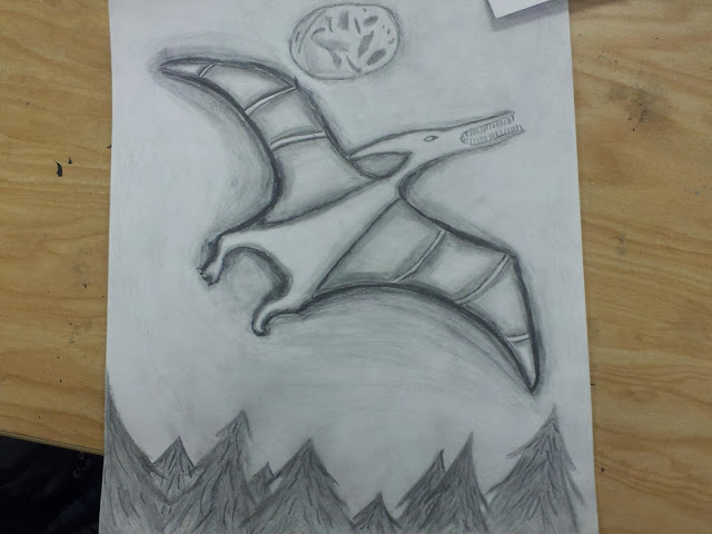
Thinking of
scientific ideas, dinosaurs kept coming to mind. Ever since I was a
child, dinosaurs have interested me. I thought that they would be
good for a drawing as they are large majestic animals. I ended up
choosing a pterodactyl because they are easier to draw than a T-Rex,
my first idea. The mini lessons were very helpful, as I was very
bad at shading before going into the assignment. By the time I
started the project I had a pretty good idea about how to properly
shade a drawing. The main contrast was between the pterodactyl and
the sky, but there were other examples as well. The trees at the
bottom contrasted with the sky, and there is shading going on in the
pterodactyl itself. Certain portions of the wings are individually
shaded. I chose pencil as the medium because it isn’t as messy as
charcoal and I find it easier than pen. I used the technique of
starting on the darkest portions of the drawing and moving outwards.
I would then go back and attempt to blend the colors together to make
them appear seamless.
The whole idea was a risk, as I am not
very good at drawing animals or shading. Originally, I thought I was
going to end up doing a drawing with a face and a skull blending
together. However, I hadn’t been taught how to draw a face and
Mrs. Rossi discouraged me from it. It turned out for the best,
because the pterodactyl idea had more potential for shading and
detail. While at first the pterodactyl looked cartoonish and
unrealistic, eventually I was able to make improvements.
I enjoyed the project for the most
part, and I feel like it helped me improve at drawing. I was pleased
with the final product, though there were some issues. The moon
looked messy, which is probably because I added it in last minute to
explain why the sky was so dark. Overall, I really liked the
project.
Subscribe to:
Posts (Atom)


